Data points are used in Line, Point, Lollipop, Area, Stream, Plotted, and Radar charts to indicate where the x- and y-axis values intersect. Data points can be enabled or disabled, but enabling them can make it easier to read the chart.
Data Point Style
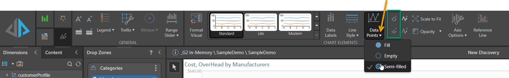
From the Data Points dropdown list (orange arrow below), choose a data point style: fill, empty, or semi-filled:
Line Charts
By default, data points are displayed in line, area, and stream charts only when hovering over them. If you want to show the data points on your visual, you must either enable Data Points in the Component Ribbon or enable Shapes in the Formatting panel.
Data Point Size
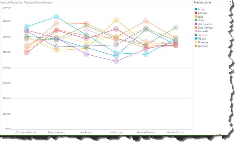
When working with line, area, and stream charts, you can increase or decrease data point size via the relevant buttons (green highlight above) in the Component ribbon.
In the image below, data points were enabled, set to semi-filled, and increased in size:
Tooltips for Line and Area Charts
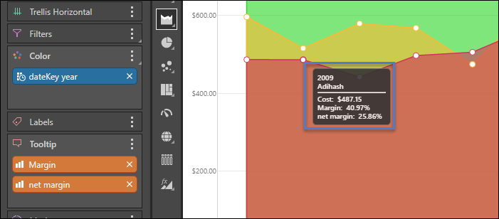
There are two types of tooltips when working with line and area charts (red highlight below). The type of tooltip displayed depends on whether or not data points are enabled from the Component ribbon.
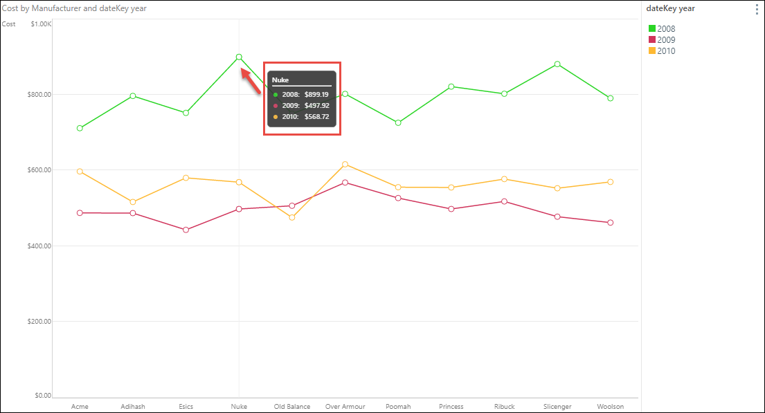
The default tooltip for these visualizations contains a title (which is the member element on x axis for the given data point) and a list for the data point; the list contains all the member elements in the legend, color coded accordingly, and the corresponding measure results from the y axis. Additional measures in the Tooltip drop zone will not be displayed. The data point being displayed in the tooltip is indicated by a vertical line (red arrow).
If Data Points are enabled from the Component ribbon, the regular tooltip will appear when hovering over the chart's data points (blue highlight below), while the line chart tooltip (described above) will appear when hovering elsewhere in the chart.